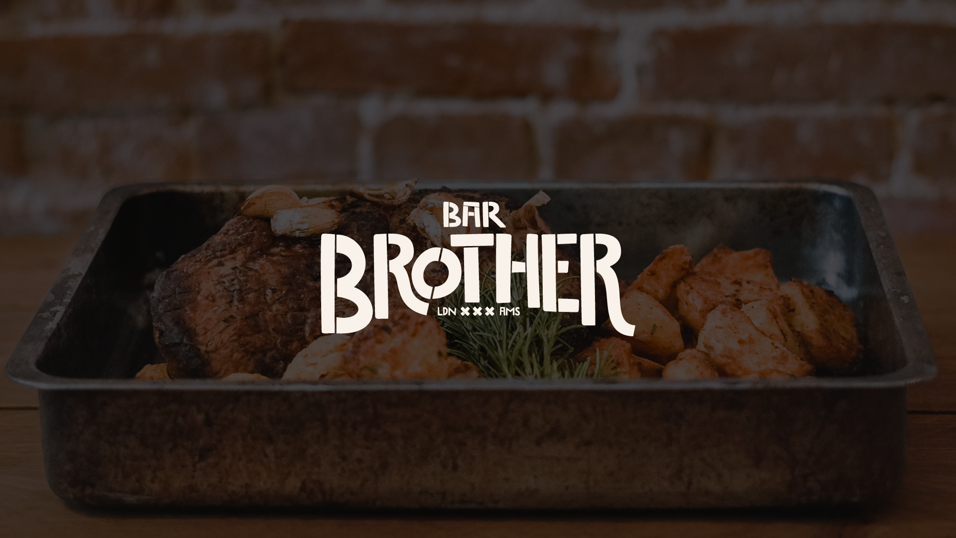
Brand Identity Case Study: Bar Brother
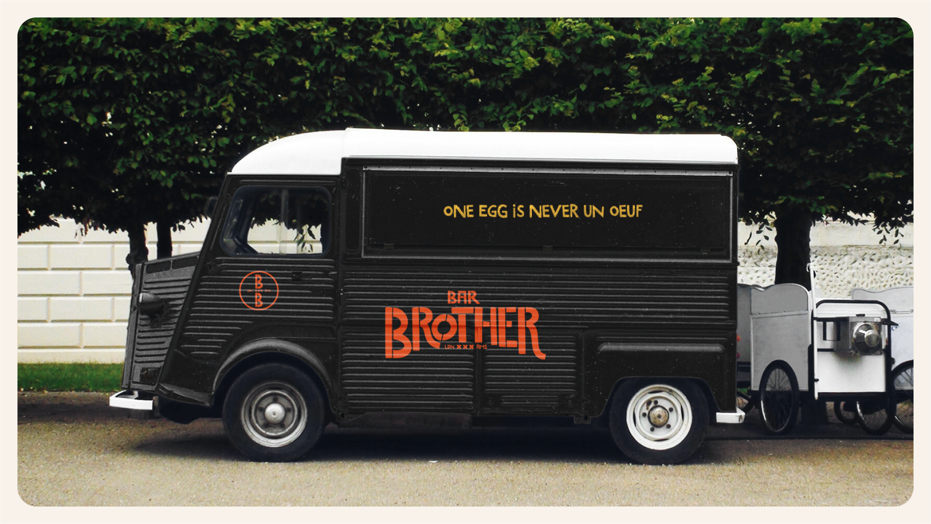
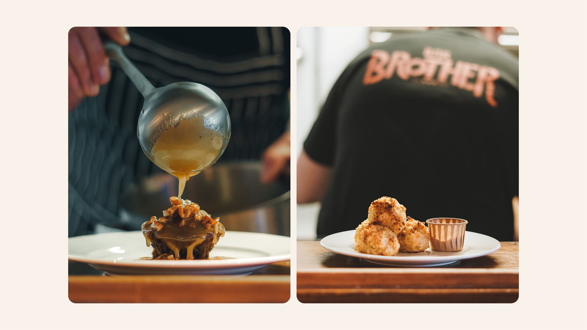
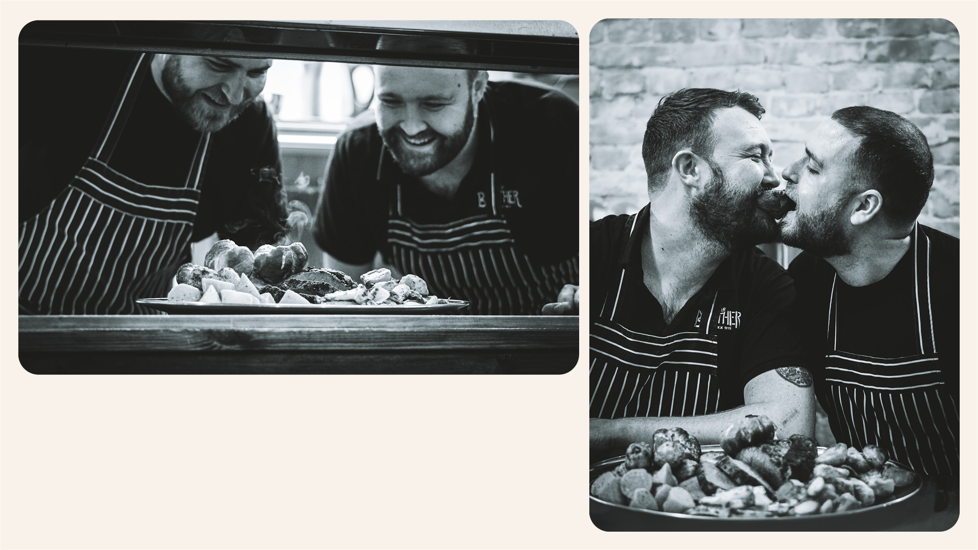
Background: Bar Brother is a recently opened popular bar located in the heart of Amsterdam, serving mouth-watering traditional pub food. Founded by two expats, Dave and Liam, the venture started as a food truck delivery service under the name “Brothers Roast” during lockdown. The duo, passionate about bringing traditional English roasts and pub snacks to Amsterdam, saw tremendous success over a few years, leading them to open a permanent space and rebrand as "Bar Brother".
Challenge: With the transition from a food truck service to a permanent location, it was essential to update the brand identity to reflect the new, permanent position without sacrificing the existing brand personality that their customers had come to love. The target audience comprised millennials, friendly individuals, food enthusiasts, and British ex-pats living in Amsterdam, and the brand needed to continue to appeal to these groups while also attracting new customers.
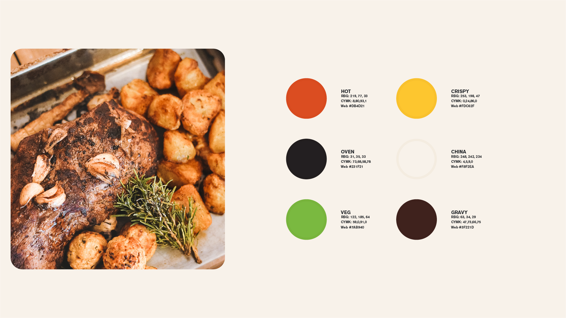
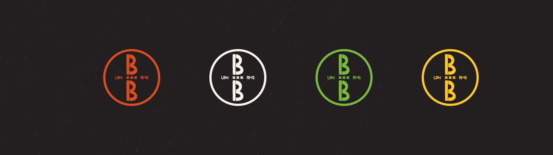
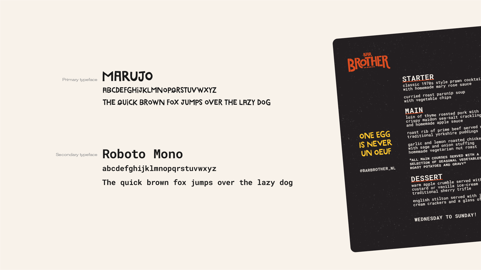
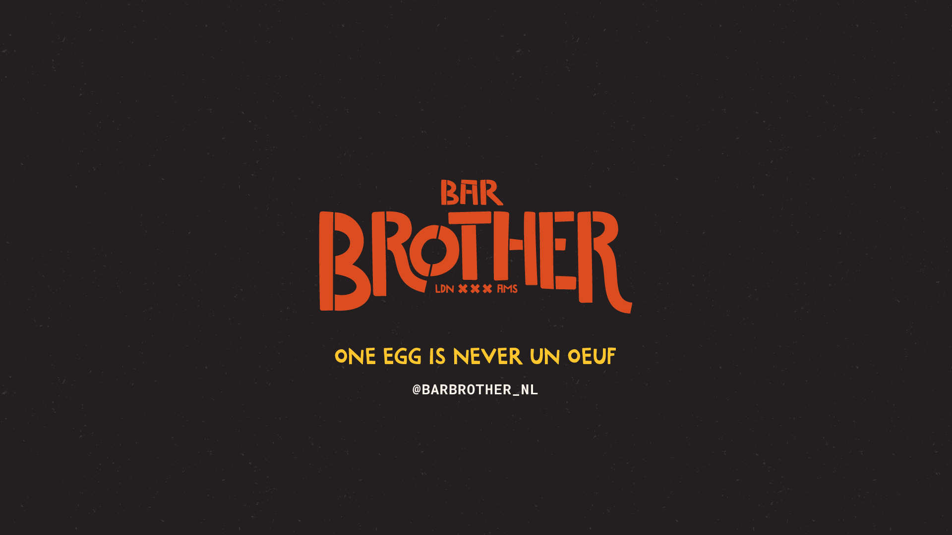
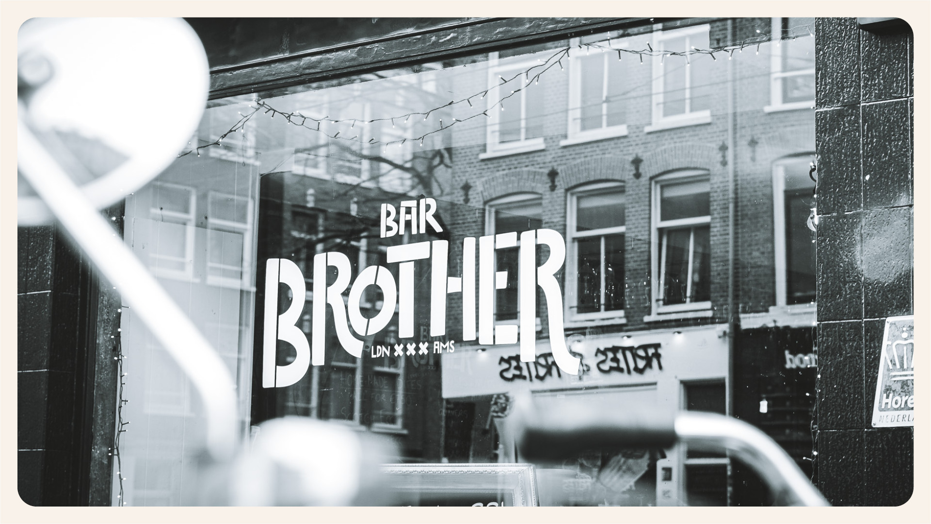
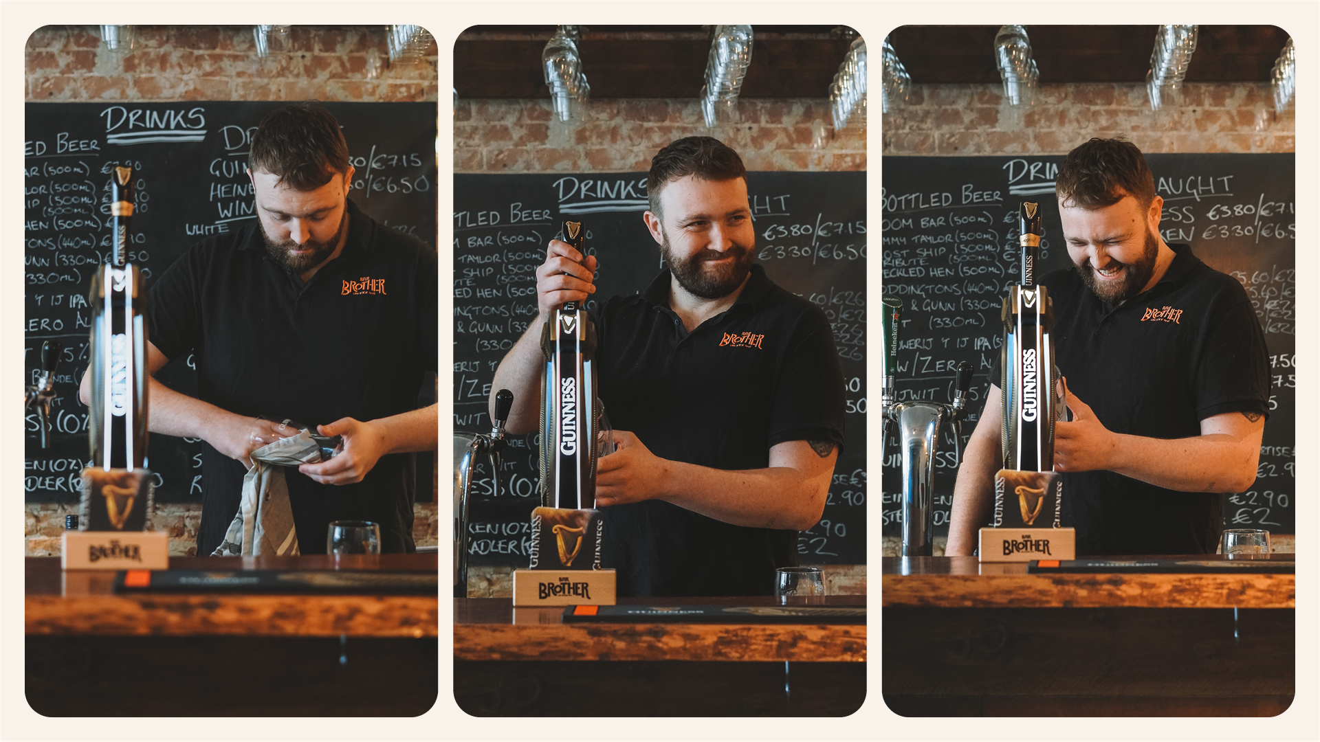
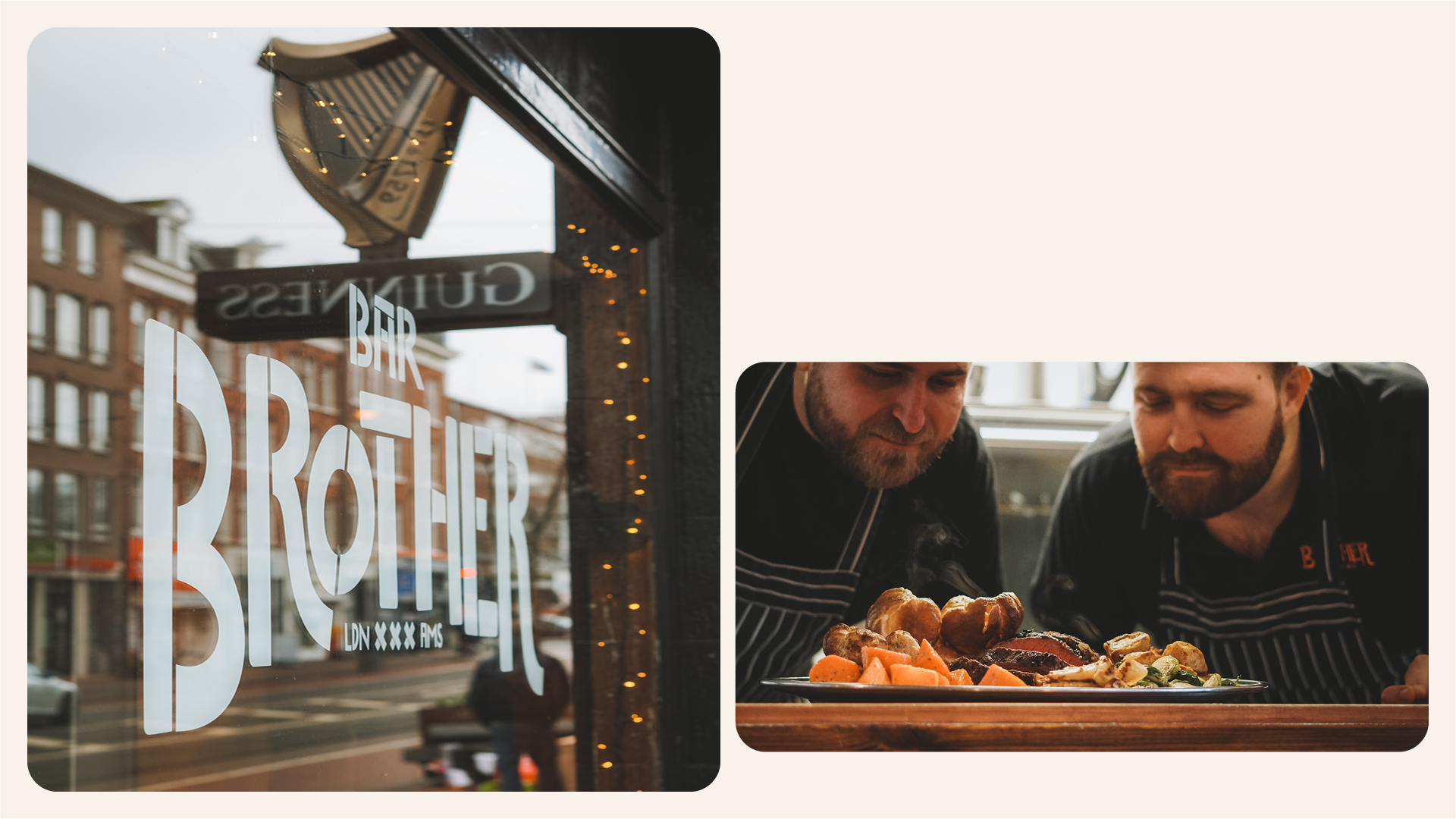
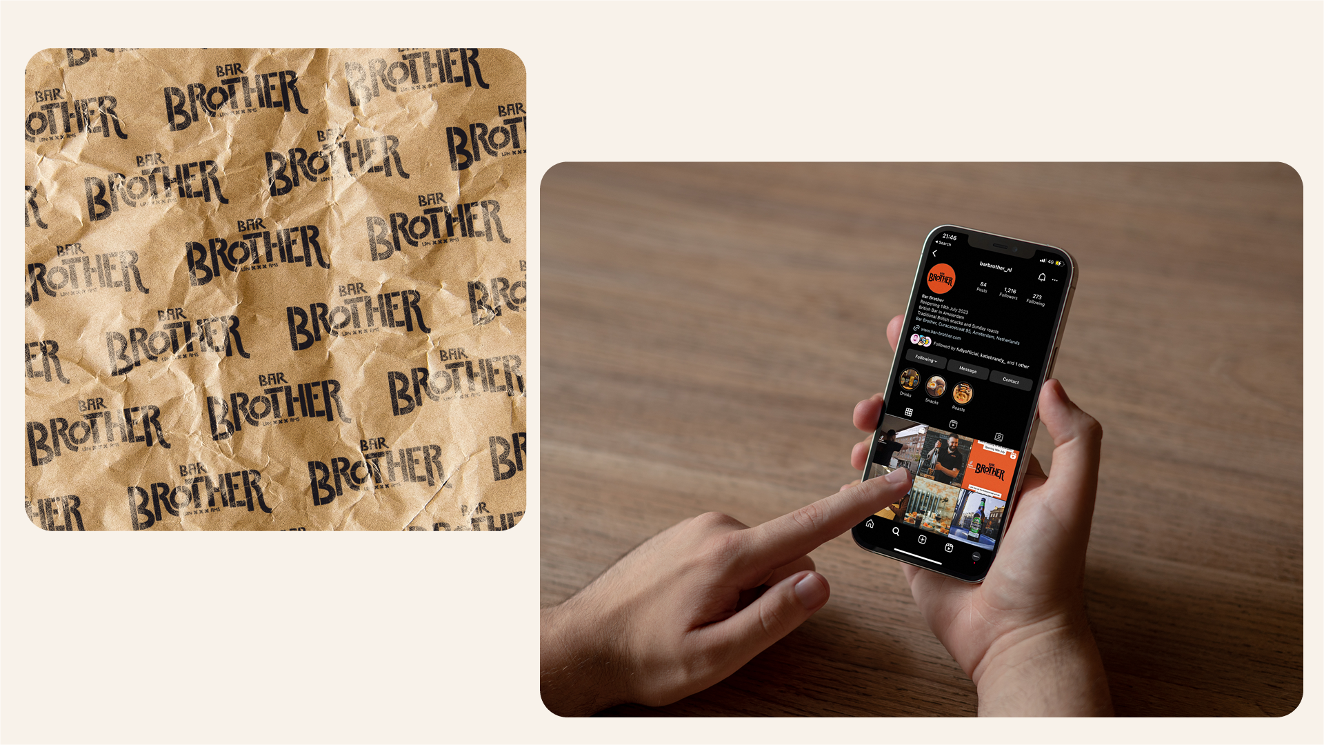
Solution: Working closely with the founders, we redefined the brand's 'Why' and target audience, digging into its core values and audience needs. We then updated the brand identity - logo, colour palette, and typography, and introduced motion design. The updated logo retains elements from the original Brothers Roast but is refined for the new establishment. The selected colour palette and typography created a warm, inviting atmosphere, and the added animation brought a modern touch that resonated with millennials.
Result: The refreshed brand identity nailed it by bringing the heart and soul of the original Brothers Roast into the new Bar Brother space. Their loyal customers loved the smooth transition and the familiar vibe, and it also caught the eye of new folks drawn in by the modern yet cosy aesthetic. This rebranding set Bar Brother up as a go-to spot in Amsterdam, hitting the spot for British expats missing a taste of home and locals on the hunt for a one-of-a-kind dining experience.